Overview
My role: Product designer
Team: 1 PM, 1 engineering lead
Duration: 3 months
Opportunity
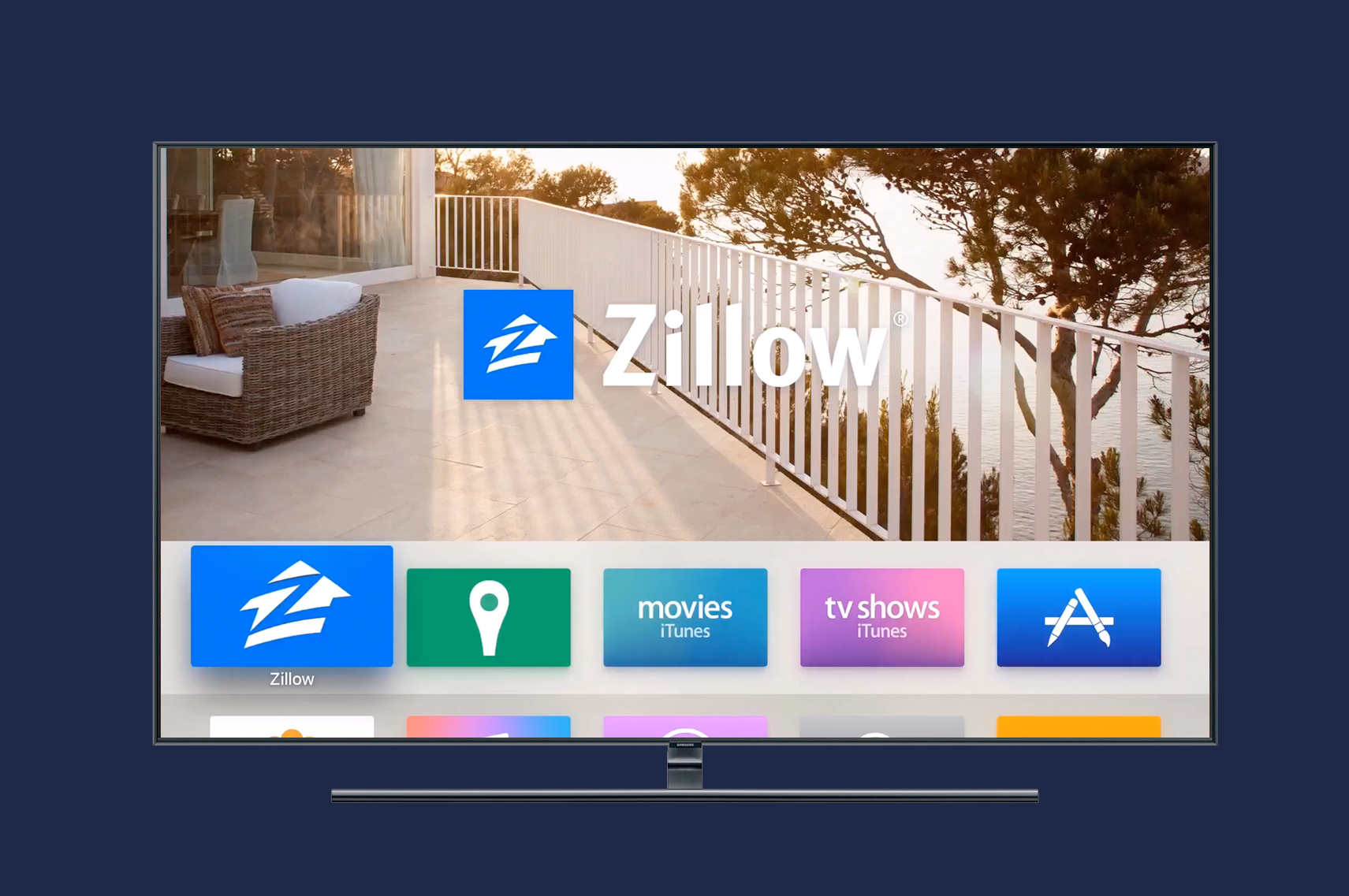
Although Apple TV had included apps from media companies such as HBO and Netflix for years, 2015 marked the first time the platform would be opened to everyone. Would a Zillow experience make sense in a communal living room situation? Would our users find value in the experience? My task was to find out.
Discovery
The first challenge designing for this project was that the hardware and operating system had not been released yet. The new remote introduced a unique input pattern of touch and direct input with several fixed hardware buttons. With no real world users to test with, the best my team and I could do was review design guidelines and get familiar with the pre-release SDK and demo apps.
Updated Apple TV hardware and remote
Design
After we felt more comfortable with the new hardware we started discussing design concepts. Zillow has always been a map driven experience, but the new Apple TV did not include native maps in any form. Years of testing and research had taught us that our most compelling content was home data and images, so we started there and hoped the lack of maps wouldn't be too much of an issue.
Although we didn’t have map services we did have access to a user's location. We assumed an Apple TV would most often be setup in a home, and we knew users care about what’s happening in their neighborhoods. Based on this knowledge we designed the app to start by displaying nearby active listings sorted by distance.
Demo build of the Zillow Apple TV app
Iterations
Another concept we felt might work was presenting homes that shared similar attributes as collections. Our design team had been thinking about this concept as an easy entry point into unique inventory and because of the timing of other teams backlogs we were able to be the first to ship this concept at Zillow. We defined ten possible collections that could be displayed in six possible slots based on local inventory availability.
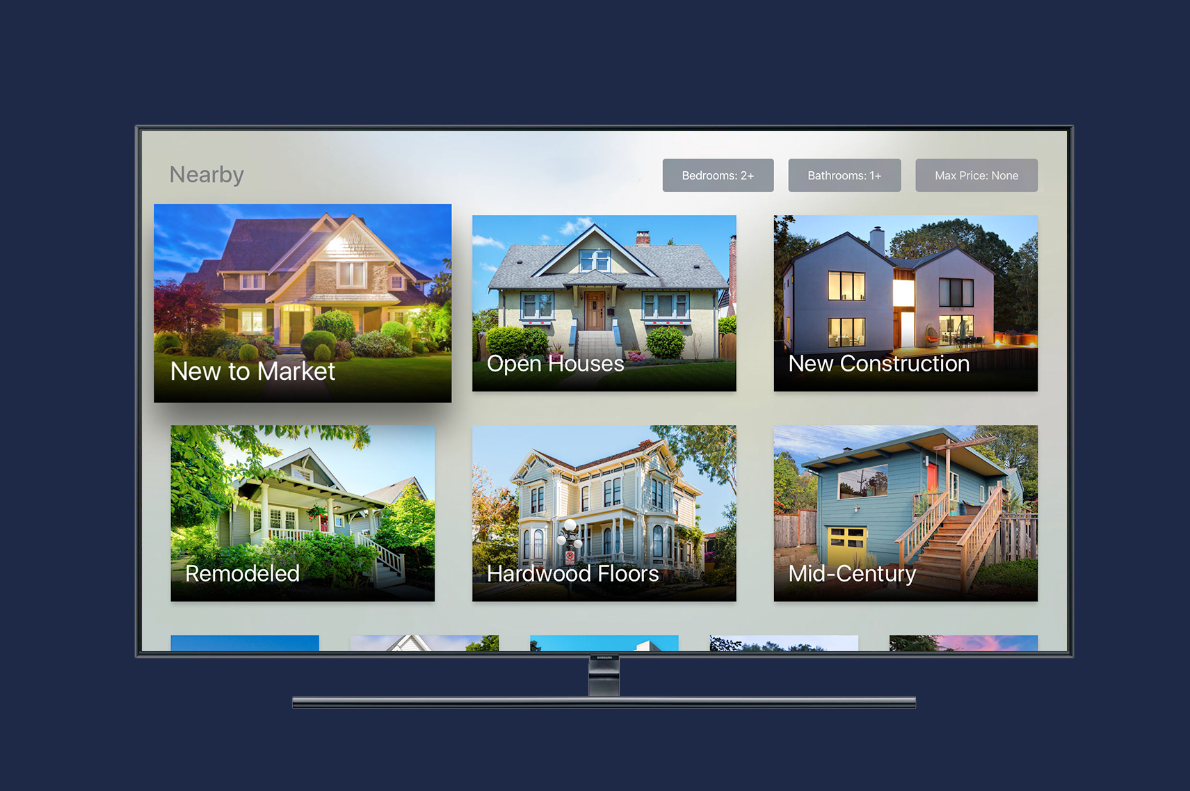
Example of six collections of similar homes to simplify browsing
While a large TV screen seemed like a great place to view photos, we assumed it wouldn’t be a primary place to search, filter, and save homes. To tie the experience back to the rest of Zillow we included account sign in so users could view saved homes and searches that were setup on other platforms.
Finally our content team had been working on an initiative to produce original Zillow video content and we thought Apple TV would be a natural venue to support that.
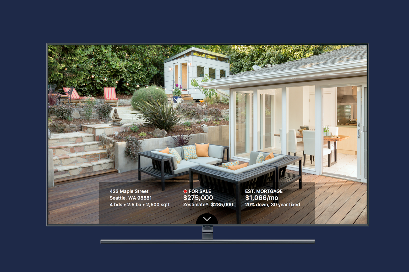
Home detail page with key facts and full screen images
Result
Apple was excited by our work and featured us on stage during the Apple TV launch event. Initial user reviews were great but faded quickly.
I wondered if the lack of a map was frustrating to our users, but I also noticed in analytics that a surprising number were saving homes to view later. This led me to believe that contrary to our ides that Apple TV would be mostly a viewing platform, it seemed users were home shopping on their TVs. If this was the case I knew they would appreciate being able to filter results based on bedrooms, bathrooms and price, something that was cut from the initial launch.
While I was unable to get research support to test with users I was able to get filtering prioritized before the holidays and our reviews and rankings have been slowly improving in the months since.
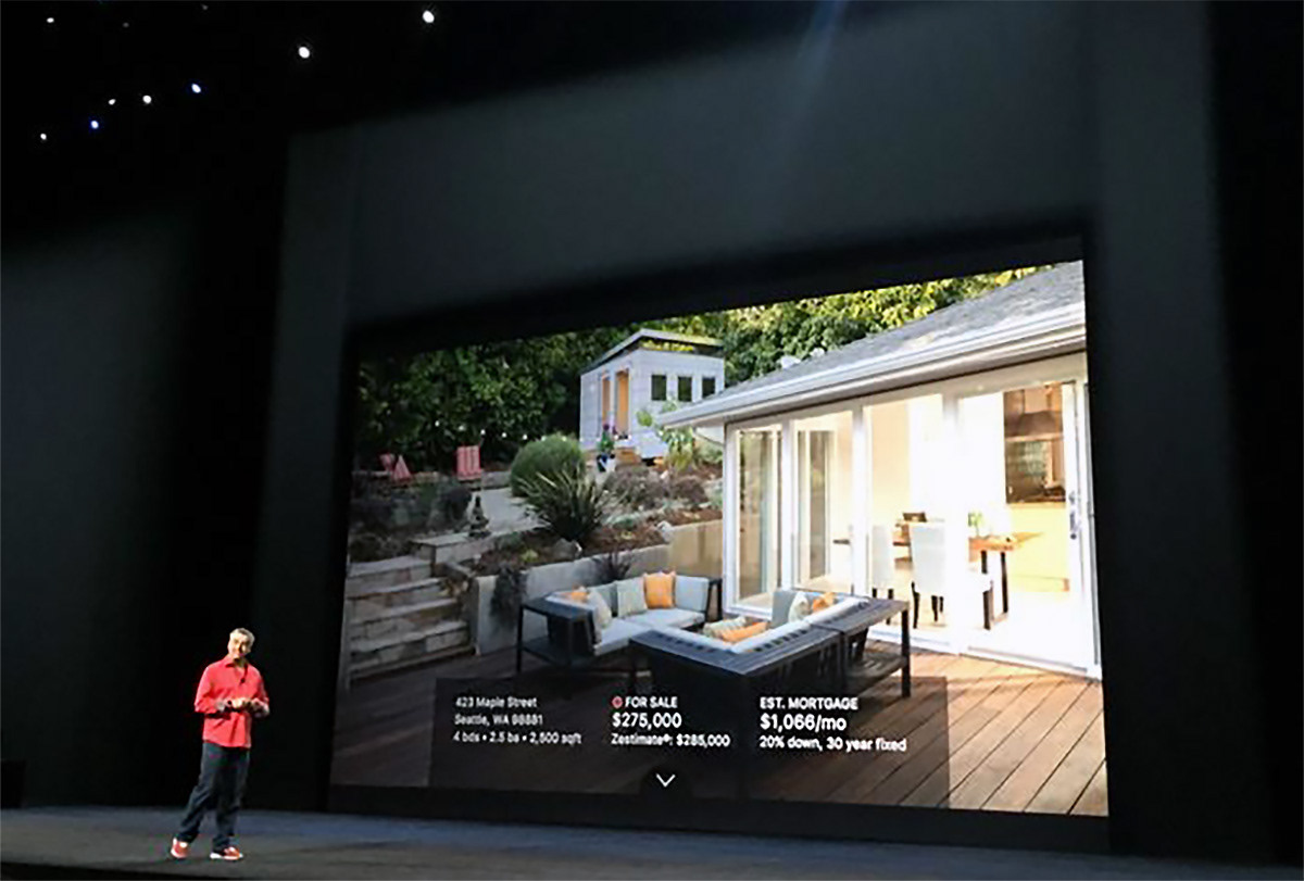
Zillow Apple TV App announced by Eddie Cue at Apple TV event