Opportunity
Nordstrom already had a first generation mobile website when they approached Ubermind to build the next generation experience. The old site was optimized for low bandwidth, low hardware requirements and would persist for lower end devices while the new experience was to be optimized for iPhone and Android. Nordstrom had noticed traffic from these higher end devices had been growing explosively and they wanted to create a more premium experience for their higher end customers.
Process
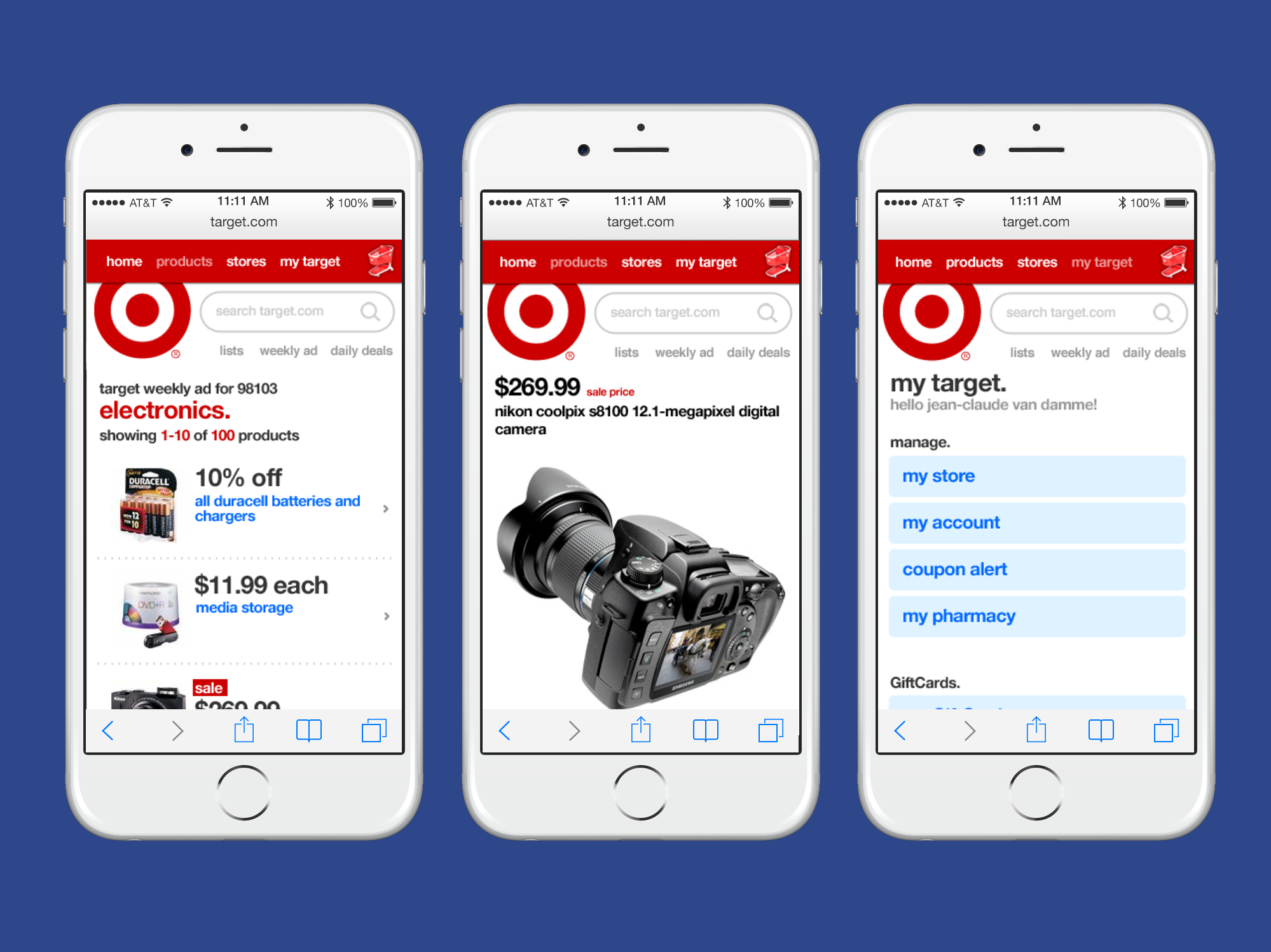
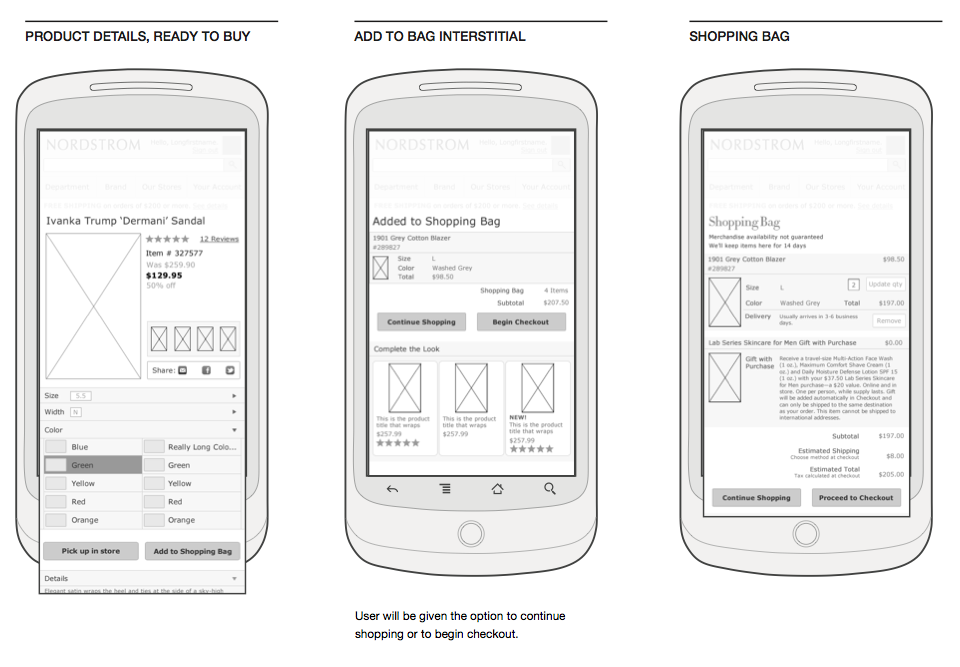
We had 8 weeks to design and build the front end of this new site before one of Nordstrom’s large twice yearly sales. While one of our designers focused on translating the desktop homepage merchandising modules, I worked with another designer to translate Nordstrom’s robust filters into a mobile friendly experience. We knew a heavy JavaScript solution was off the table but we wanted users to still be able to filter by color, size, fabric, and the multitude of other options that Nordstrom presented on their desktop site.
In the end we decided loading a full page filter UI made the most sense from a user experience and bandwidth perspective and we were able to carry over all desktop functionality to the mobile space, which was no small feat at the time. I also worked closely with the development team writing HTML5 templates that could later be used to integrate with Nordstrom’s existing back-end.
Result
Due to our agency relationship we were never shown metrics from the redesign but the site was well received in the industry and held up as an example for other fashion sites to follow.