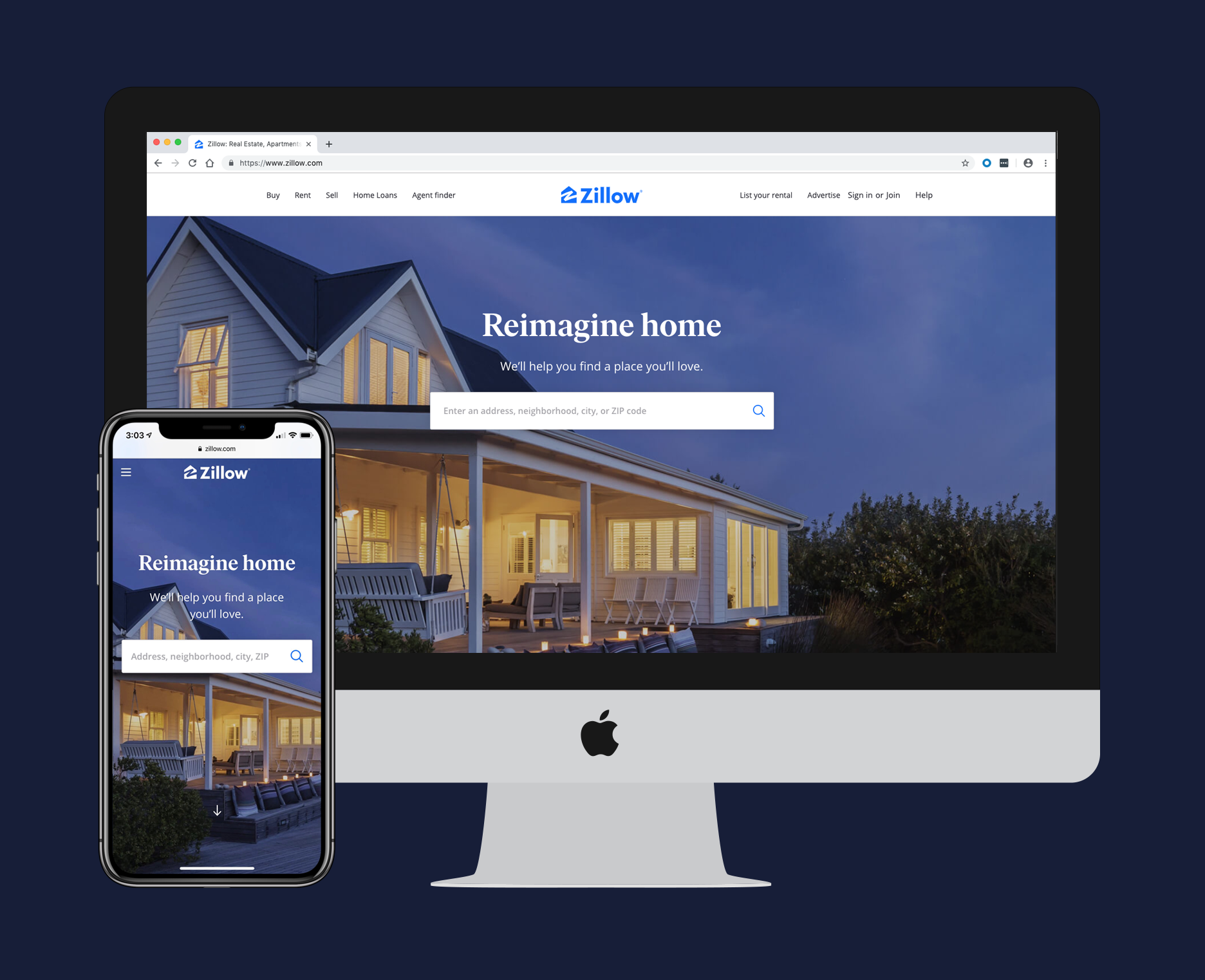
Rebranded desktop and mobile web homepage
Overview
My role: Product design manager
Team: 1 design director, 2 product design managers, 7 product designers, 2 researchers, 4 PMs, 4 engineering leads
Duration: 12 months
Opportunity
Zillow shipped a major rebrand in April 2019 driven by an updated logo and visual language developed by the marketing team. In coordination with the rebrand, the product teams planned a design refresh to our core shopping experience and home detail page on web and in apps. The design team led this effort with a series of design sprints, concept tests, usability tests, and design refinements over the 12 month timeline.
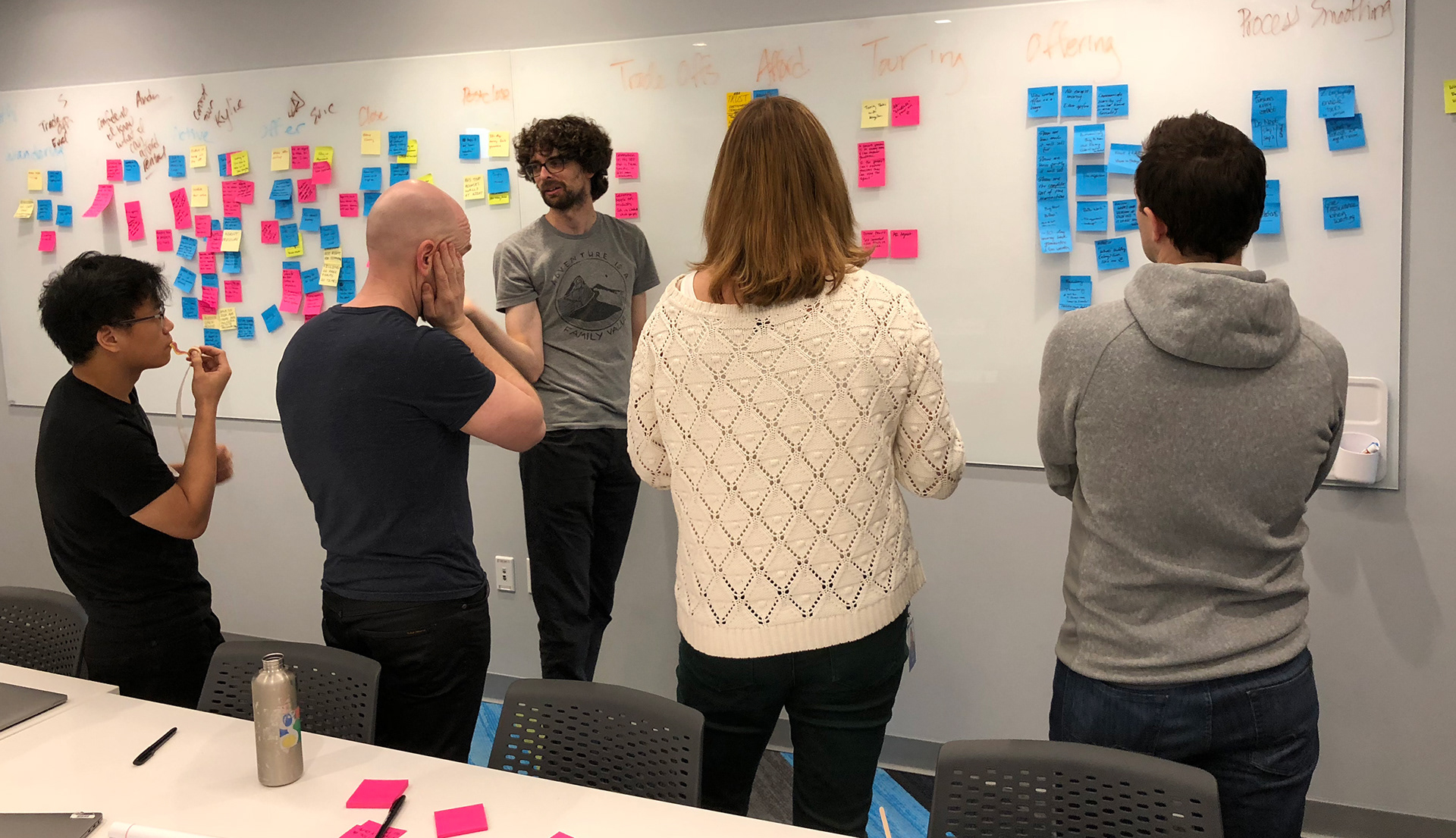
Discussing concepts and affinitizing ideas
Discovery
We began our first design sprint by reviewing the latest findings from our research team. As part of the discovery process they had done some foundational research around how people shop and find homes, as well as how they ultimately decide which homes to tour in person. Additionally they ran a major competitive analysis on the Zillow experience versus major competitors. These two pieces of research fueled the weeks of design that followed.
Research Insights
The research made it clear that our redesign should focus on reducing noise, increasing signal, and reducing friction to help users find relevant homes. Users felt our current map experience was overwhelming and did a poor job of helping people understand which homes were best for them. In some places we were giving them too much data, and in others we were making it too hard for them to find the data they were looking for. It was clear that users had fully embraced being in control of their own home shopping experience and our product offerings needed to evolve to match their expectations.
Design
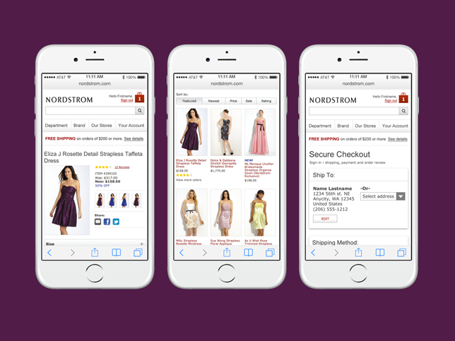
Based on our findings from the discovery phase we identified a happy path to cover for the redesign. Beginning with the map and search results, we simplified the list cards and filters by using more human language and presenting more customization options for people to better control their search efforts. We worked to reduce the noise in our map experience by bringing in personalized map markers that would help users sort through the noise.
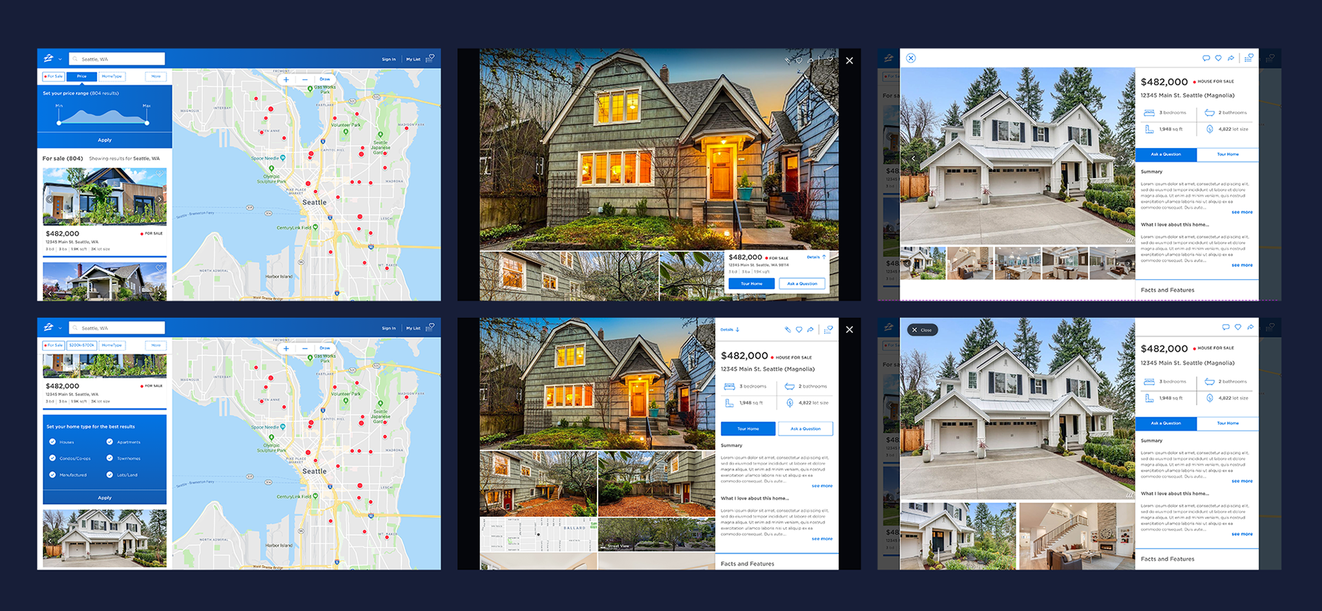
Early iterations of shopping and home detail pages on desktop
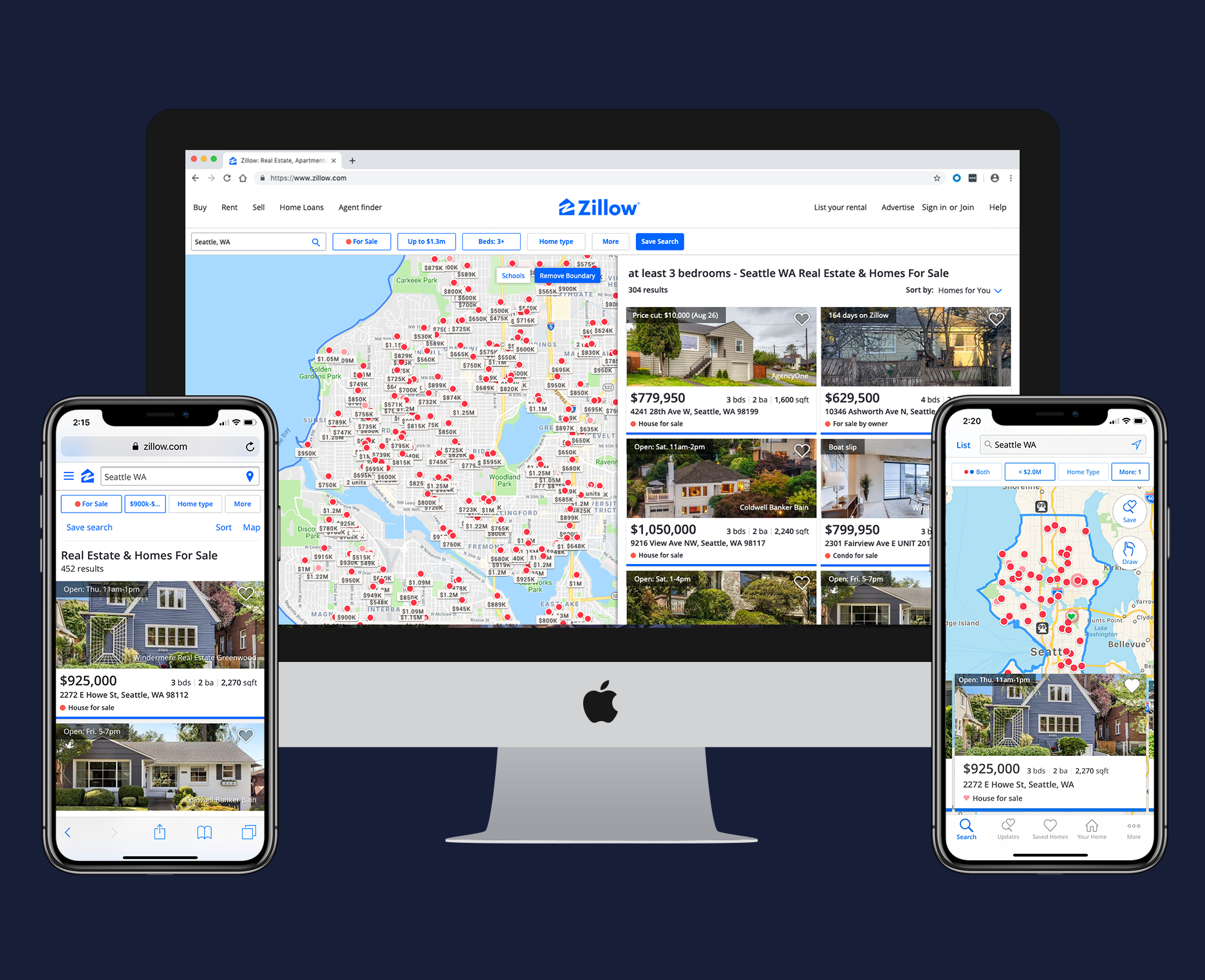
Final versions of mobile web, desktop, and app shopping experiences
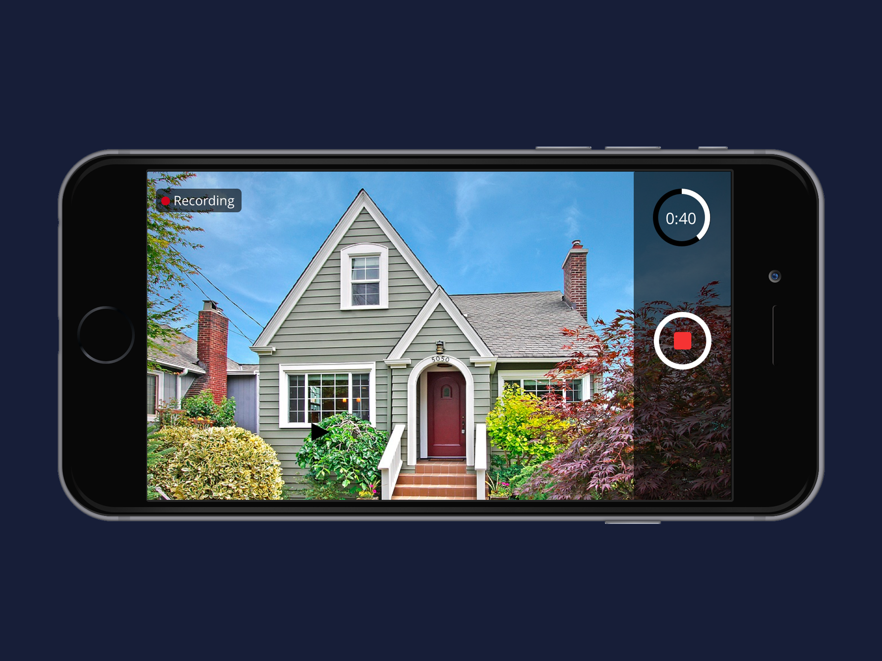
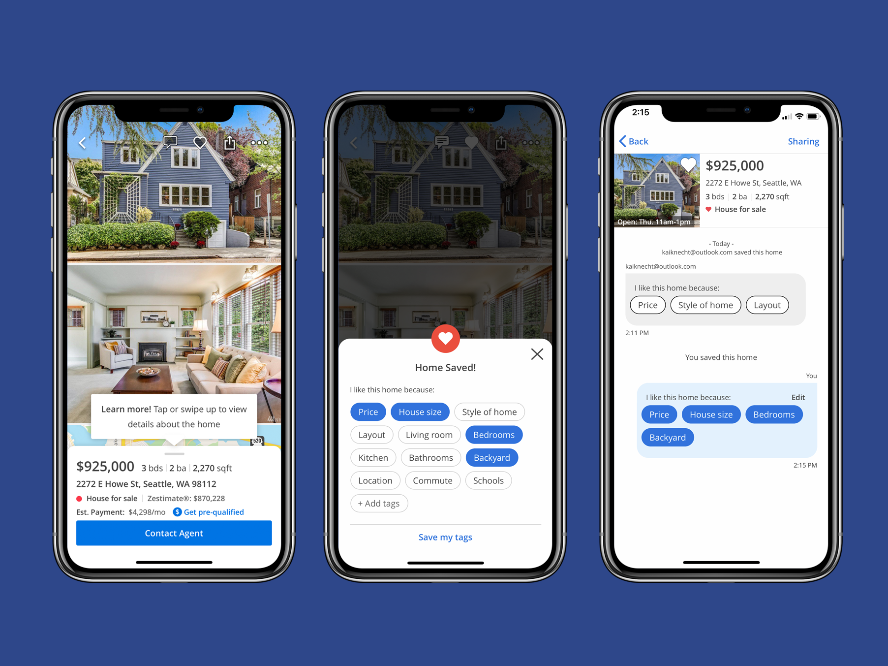
For the home detail page we pushed hard on the insight that photos were critical to a user’s shopping experience. We redesigned our app home detail page to allow users to view multiple photos on screen at the same time and then immerse themselves in data when they were ready. On desktop we achieved a similar experience by moving the photos and data side by side so users could independently scroll and compare photos and facts at the same time.
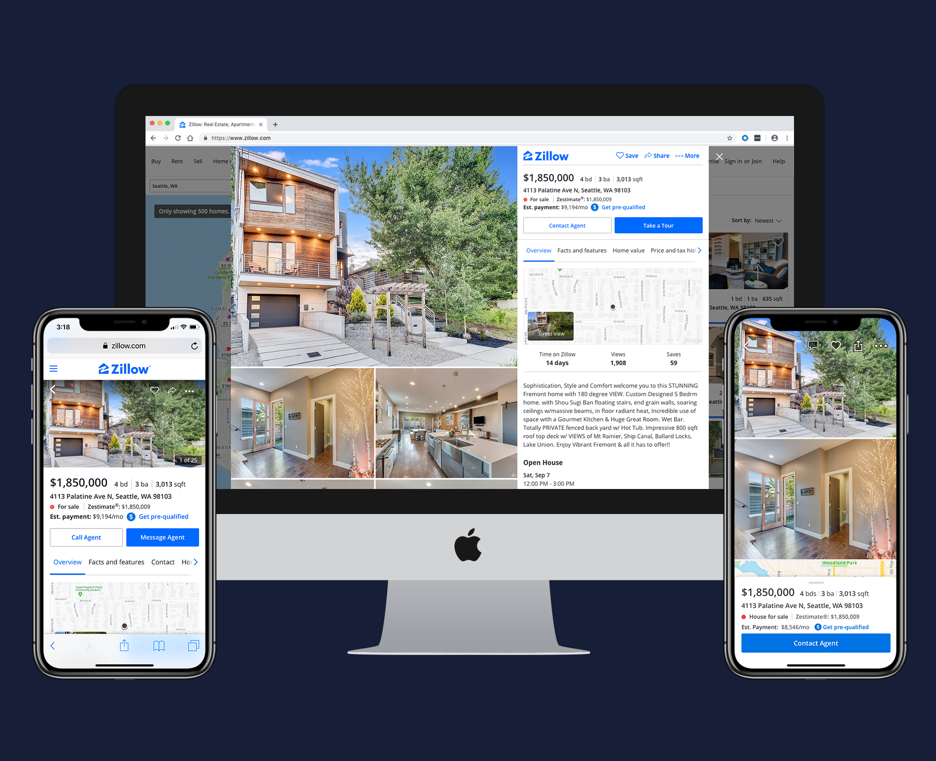
Final versions of the mobile web, desktop and app home detail page
Results
To support the rebrand day and date launch we weren’t able to A/B test our new experiences in the way we normally would. As early results came in we discovered a combination of usability and engineering bugs that were degrading the experience. Working quickly with our research team we identified two major design issues that needed resolving immediately.
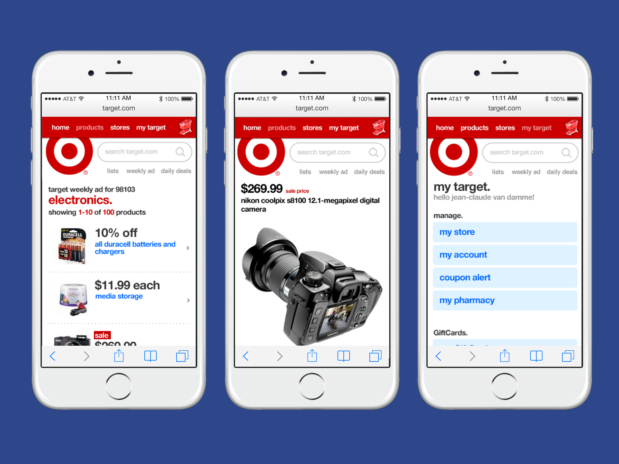
The first issue was with our mobile web home detail page. While the immersive photo experience tested well on native apps the technical limitations of the phone browser had introduced a critical usability issue. After exhausting all technical options for a fix, I led my team through a redesign that stayed true to our initial vision while eliminating usability issues.
The second issue surfaced on the desktop home detail page. In our efforts to make image browsing easier we had inadvertently made browsing and finding data harder. I led a design sprint to identify solutions to this problem with a team of 5 designers. We explored everything from reducing clutter and adding white space all the way to allowing the user total control of their view-port size. Based on usability testing and consulting with the engineering teams we settled on a simplified design that greatly improved data discovery and the users feel of control.